12.15.2010

Christi-Leigh Wedding Donation Cards

As I try and pave the road that will lead me into the custom, boutique-style wedding invitation business I found myself speaking to a young lady I work with one afternoon and she mentioned she'd love for me to design 250 donation cards for her wedding. I had showed her images of another set of custom invitations I had done and she asked if I would be interested in helping her with this project.

In lieu of providing her guests with yet another small gift that will most likely find its way into the junk drawer of your kitchen, Christi and her husband-to-be decided instead to make a donation to the Richard T. Dalton Scholarship Fund which was created in the name of her cousin, Ricky, who had passed away just a few, short years ago. This was obviously an important part of her wedding day and because of that, this became an important project to me.

Considering the wedding was in December and close to Christmas (just a week and a half ago actually) the main color of the wedding was red. The bride has also chosen to use a graphic of Cala Lilies on her invitations and I decided to keep with that theme to make sure all of her items maintained a cohesive look and feel. That's an important part of graphic design that I think a lot of people don't make a focus, when indeed it should be. 


The goal of this project was to create something simple yet elegant. After all, with a project like this I feel as if the design should be very delicate so as not to overshadow the message behind it... while still maintaining a strong sense of design. You'll notice while the font remains a strong red, the Cala Lilie were scaled back to the point where they essentially became a dark pink hue. The paper I chose for the matte was Stardream Jupiter Red which has a cool glimmer effect and it's a pretty festive color. In an effort to balance that I printed the actual card on a thick, recycled white, cotton cardstock I purchased. Then, using disposable, double-sided tape guns I hand assembled each of the 250 pieces and called it a day. If I had to guess I'd say I spent somewhere around 10 hours on this project between design and production (cutting and assembly).

I have to say, I'm really happy with this end result. Between how important I knew this was to the bride (and how happy she looked when I dropped them off two days before the wedding) and the overall appearance of the final product this was a nice project to work on. I've been really lucky as of late with finding some really sweet projects to work on (more on those other projects to come soon) and this was definitely one of them.


11.22.2010

The new and improved DeLorenzo's (Hamilton Avenue) website


Well, I feel as if I started off strong with this blog but it seems to have been forgotten since July. Things have been good, very busy actually, and I've been producing a fair amount of cool work so I s'pose can't much complain.

Over the past few months I've developed a new set of Wedding Invitations for a client (which will be featured in my next blog post), Donation Cards for another wedding, a poster and tri-fold brochure for Patriots' Week in Trenton (yet again, another blog post) and, of course, the exciting project that this post is dedicated to...

 
... the new and improved DeLorenzo's Tomato Pie's website.

The existing DeLorenzo's logo

Let me preface this post by saying that I am a gigantic fan of DeLorenzo's tomato pies. I've been enjoying their pizza for as long as I can remember and I've honestly never tasted a better pie and I am 100% certain I never will. This was one of the many reasons this was such a kick-ass project for me to work on. Client projects aren't always easy to be excited for yet I probably couldn't have been more excited for this project if I had tried. As a self-proclaimed pizza "expert", I am a tried and true fan of Hamilton Avenue. From the superior tomato sauce and overall flavor of the pie to the ultra-friendly wait staff to the family-like atmosphere of the restaurant, Hamilton Avenue makes a significantly better pie. After all, it's Zagat Rated for a reason.

Serving their own, signature brand of "Trenton-Style" Tomato Pie since 1938, DeLorenzo's Pizza is a staple in the City of Trenton and the outlying areas. Having two locations only a mile or so from each other, many debates run rampant within the city... Are you a fan of Hudson Street or do you prefer Hamilton Avenue? You'd be hard pressed not to find someone who has an opinion on the matter. Heated arguments over the best pie in Trenton happen frequently with most people choosing a specific pizza joint from their neighborhood but most of the people you will talk to all agree, Delo's of Hamilton Avenue is head and shoulders above the rest. In Trenton, DeLorenzo's holds almost an iconic status. It's storied history, out-of-this-world tomato pie and incredibly friendly atmosphere all combine to make this the best pizza you'll ever have. This much I promise you.

Although I'm a lifelong fan of their pizza, I first met Rick DeLorenzo last year when I was enjoying a pie with some friends. I had started a Facebook fan page for DeLo's of Hamilton Avenue and word got to Rick DeLorenzo (owner and chief pizza maker) that I was the one responsible. After coming out from the kitchen to introduce himself to me we started to chat about developing a new web presence for them. The site they had at the time was a simple, free web template that used poor graphics and really wasn't much to look at. The way I saw it, a place with so much history and a place so loved by so many deserved a better presence on the web and I enthusiastically jumped at the opportunity to work on this project with them.

 
Going into this project I knew I needed to accomplish a few key tasks:   

  1. Develop a warm, friendly and inviting website using completely custom graphics 
  2. Promote the storied history of DeLorenzo's utilizing photos and a text
  3. Sync the website with Social Media outlets such as Facebook, Twitter, FourSquare, Yelp and more

Two of the most identifiable characteristics of Delo's is the faux wood paneling and the use of the color red throughout the dining area. If you've never had the pleasure of visiting DeLorenzo's and are just reading about it for the first time, it may sound outdated and old but to the contrary, these characteristics all make up it's incredible atmospheric charm. From the old Coca-Cola tumblers filled with pebble ice to the red vinyl seats and booths to the faux wood paneling... these were all important pieces of it's very authentic, retro feel. The great thing about DeLorenzo's is it's not trying to be retro or kitschy... it just is. It's the real deal.

As I mentioned earlier, the history alone of Delorenzo's is quite lengthy and fascinating. For almost it's entire existence it's been a true family run business. Aside from their one longtime employee (who's been with them since 1961) almost all employees are family. I truly felt the best way for us to recreate their web presence was by promoting their history, the fact that it's a true family business and using old photos and images from throughout the years. I wanted people to not only visit this site and learn about Delo's but to read about the history, get to know them and most importantly, relate to them. Customers who can relate to your business become customers who continue to come back again and again. True story.

"The history of DeLorenzo's Pizza began when my grandparents, Pasquale and Maria DeLorenzo emigrated from a small town near Naples, Italy called San Fele. Like a great majority of Italians who came to America to escape the poverty of their home country, Pasquale and Maria settled in a small row home on Hudson Street in Trenton, New Jersey where they raised 12 children. With so many mouths to feed, hard work became a way of life for every member of the family." - An excerpt from the history page

When all was said and done, I really couldn't be much happier with the final outcome. From the retro-style fonts to the wood paneling background to the history and photo gallery pages I really feel as if I was able to capture the essence and family-like atmosphere of DeLorenzo's, which was my main focus and goal. Moving forward, there are a few updates I plan to make such as a rotating banner image to highlight their fantastic tomato pie and other little odds and ends that make eating at Delo's a great experience.

The feedback from both the DeLorenzo family and their customers have been excellent. The bulk of the comments I've gotten thus far remark how warm and inviting the website is. Considering that was the main goal from the very beginning, I'll happily say that this was an extremely successful project.

 
To visit the new and improved DeLorenzo's website please visit www.delospizza.com.


The finished product
 

7.26.2010

The Bentley Avenue yard sale: A documentation of stuff

Call me ridiculous (actually, please don't) but I love yard sales. I am totally and completely enamored with other people's junk. I fully subscribe to the theory that one man's trash is another man's treasure. I'd rummage through people's drawers and cabinets all day if they let me. As long as our schedule permits, my wife and I will visit Columbus Farmers Market or Golden Nugget Antique Market as often as we can. So yeah, other people's junk = good times.

A few short weeks ago, my wife and I, along with some neighbors got together for what has become an annual summer block sale. It's generally 4 - 6 families that all live next to one another. I create some signs for the busy street we live off of to drive traffic down our road and we usually place an ad in the local paper, utilize Craigslist and pray for favorable weather. This year it was incredibly warm. We're talking 90º+ by roughly 9am. In an effort to beat the heat and make the best of an otherwise very warm morning, I decided to break out a large iced coffee, the trusty Hipstamatic iPhone app on my new iPhone 4 and a little creativity to document this annual event.

Below are a handful of images that were taken that day. If you'd like to view the entire album, head on over to The Rockhopper Creative Facebook Fan Page for the entire gallery.

And awaaaaay we go...

Beanie Babies. Collectible or terrifying? You decide.

Apparently, people LOVE costume jewelry

Aristocats and Guinness. Two great things that go great together.

A jacket hanging on our lamp post. This one actually creeps me out a bit.

A Beanie Babies life is one filled with solitude. Especially when no one buys you and you go back into the box.

"Someday a real rain will come and wash all the scum off the streets..." vs "I'll have pancakes in the Age of Enlightenment..."


If you'd like to view the entire album, head on over to The Rockhopper Creative Facebook Fan Page for the entire gallery.


7.19.2010

The birth of Art All Night - Trenton

Growing up I was never truly exposed to art or culture. To me, art was a poor excuse for graffiti sprayed on broken concrete walls that ran along the embankment of the Delaware River. Culture was seeing the homeless drink themselves into oblivion along the rail line that ran through my neighborhood (now Route 129). I truly had no concept of art or culture until I grew older and started to explore the world on my own. Once I started down that road, it began a lifetime love affair with other folks' creative works.


In 2007 a friend of mine approached me with an idea. It was daring. It was lofty and most importantly, it was exciting. This friend wanted to create a 24-hour art show that showcased local musicians, neighborhood eateries that offered exciting cuisine and a setting for artists of all ages, backgrounds and education to display their art in a gallery-style setting... all the while promoting the unused, abandoned structures in the City of Trenton. It sounded crazy, to be honest. I wasn't sold but he was passionate about it and so I decided to throw caution to the wind and I stepped on board. Art All Night - Trenton was born.


Now, something most people may not realize, is that professional graphic designers (most creative professionals actually) are approached constantly to donate their time and talents for the "greater good". It's sometimes a challenge to choose when and where the best avenue is to donate that time and those talents. I've dealt with enough non-profits and upstart businesses to know that you can put forth your grand masterpiece and it still doesn't mean anyone will ever be able to see and appreciate the blood, sweat and tears you've put into the work. I equate it to the ol' saying, "If a tree falls in the woods and no one is there to hear it, does it make a sound?". The same can be said for an artists work... if you create your pièce de résistance and no one sees it, was it really all that worthwhile? Needless to say, we were undertaking quite an effort and this was a very strong concern of mine.


My first order of business was to create a brand. I worked on several logo designs and nothing seemed to work. Fast forward one week and dozens of design later and we had something I was truly happy with. The idea was to create gallery-quality graphics without being pretentious. To be edgy without being to brash. To design something that would stick out in the crowd and become a noticeable staple in the community. This was the finished product (located below) and it has been the face of Art All Night - Trenton ever since.

The AAN logo actually branded with a new color each year. In an effort to keep things fresh and interesting, I'll choose a generally bright and energetic color to represent AAN in any given year. This, of course, also changes the entire color palette of the event.


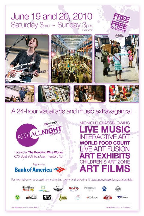
This AAN 2010 11"x17" poster was printed in full color and featured prominent images from AAN 2009 along with the creative use of type to list all of the goings on at the event. Notice the paint splatter used in the background, it carries throughout all of the printed pieces including banners and more.

The AAN 2010 5"x8" postcard was printed double-sided and full color. There were two print runs of this postcard featuring different sponsors on each run. 30,000 postcards were printed in total and were distributed throughout the region for two months leading up to the event.


Now, again, if you have yet to attend Art All Night (and I hope, if nothing else, this update peaks your interest enough to attend next year) you truly can't grasp the size of the space. We are talking about 50,000 sq. feet of relatively open warehouse space with dozens of 30 foot steel columns running the length of the main corridor. Needless to say, signage is of the utmost importance. Everything from 20 foot banners promoting sponsors to signs leading attendees to bathrooms and how to purchase a custom Art All Night shirt are required. In all, over 100 signs, posters and banners are needed each year. A massive undertaking needless to say.


This large vertical banner clocks in at 20 feet tall and 5 feet wide. Printed in full color, I decided to utilize an excellent image from AAN 2009 to top off the piece and lead the users eyes downward. Hanging from rafters 30 feet in the air, this banner served as the showcase in the main hallway at Art All Night.

A side view of the outdoor stage banner. This banner printed at 20 feet wide and stands right around 4 feet tall. Unfortunately, I wasn't able to get a true grasp of how I would hang this banner since the outdoor stage was unavailable until the morning of the event but it turned out well being able to screw it directly into the front of the stage.

I've been working on Art All Night since it's inception in 2007. A lot of folks ask me why I do it pro bono every year and the answer is actually pretty simple... I love it. In many ways I consider it partially my baby. It's truly a labor of love. The way I look at it, if you're going to go the extra mile and donate your time and talents, it should be for something worthwhile and this is about as worthwhile as it gets. Art All Night has helped revive a often dark city that has been in such desperate need of light. It's projected positivity in a town that has been in dire need of it for years. Think of it this way, in 2010 over 10,000 people attended Art All Night. Over 850 artists submitted their work and I'd dare you to walk through the Roebling Wire Works during the event and capture someone who isn't smiling. I dare you.

I am extremely proud of my efforts with Art All Night. Not too long ago I described it to as a friend as the "best thing I've done in my career" and it's true. It's not necessarily the finished work (although seeing your creative work in print never gets old) or seeing your banners hung from the rafters or even seeing someone walk into their local coffee shop and pick up the postcard that you designed and watch them share it with a friend. It's the feeling that comes over people when they attend AAN. It's truly something special and I honestly couldn't be any prouder of my involvement and the involvement of the dozens of people behind the scenes who make this important event happen. If I had a glass in my hand I'd tip my pint... instead I'll just say "thank you" and I am already looking forward to AAN 2011.

For more images of my work featured at AAN 2010, please visit The Rockhopper Creative Facebook Fan Page.

6.30.2010

I don't wanna be buried in a Pet Sematary...

As a child I grew up in the South Ward of Trenton. The specific area of South Trenton I grew up in was once a relatively industrious neighborhood populated with Eastern European immigrants but has since started to fade and fall apart. It's a sad thing to watch happen. It's the very definition of urban decay. I drive through the old neighborhood now and again... Mainly just to remind myself how different things look now. Sometimes to remind myself of where I came from.

Every now and then, as I drive through the old neighborhood, I find myself funneling into Riverview Cemetery. For those of you unfamiliar with this amazing place, it's a 150+ year old cemetery that houses the final resting places of people such as American Civil War Union Army Major General and New Jersey Governor George B. McClellan and John A. Roebling, designer of the Brooklyn Bridge and owner of the maze of Roebling Factories peppered throughout South Trenton. I'm rambling...

Believe it or not, this cemetery is probably one of my favorite places to spend some quality quiet time. Where some people see macabre and death I see beauty and peacefulness. Where others may see only gravestones and decrepit trees I see artwork and architecture. As a kid I would ride my bike through the beat up blacktop streets and inspect all of its nooks and crannies. I s'pose it served as an escape of sorts for me. Regardless of what drew me to this place, it's a place that's quite dear to me. There is an infinite amount of history in this place and that's so compelling to me. 

An amateur at best, I love to take photographs and there have been many occasions where I'll take off for an entire day and travel the area looking for abandoned structures or out-of-the-way places to photograph. I'm mesmerized by the peaceful decay a lot of places experience and I try to capture that with imagery. One thing I find I do is photograph with graphic design in mind. I almost always shoot a photograph thinking I could utilize it in some sort of page layout, poster, print ad or even a website. I s'pose it's an effect of what I do for a living but I truly think it makes for a more interesting composition.


What you're going to see below is a select few images that I took in 2008. I don't recall the exact date but it was early Fall and the sun was high so I'm assuming it was roughly 4pm when these were taken. Based on the subject matter I felt that B&W was the way to go here, as opposed to color. I felt as if it offered a more dramatic look to the images and I think that remains true.


All of the images below were shot using a Canon Rebel XT with a 18-55mm kit lens and stock flash.


The Receiving Vault. I can't even imagine what evils lurk inside.


A random sarcophagus laying in the weeds. 
I'm especially a fan of this one due to the extreme amount of texture.
I actually had a Gicleé print of this made on a textured linen stock which 
is framed and hangs in my home office. The detail is striking at 11" x 14"

I love the natural balance this image offers.


One of the coolest things about Riverview Cemetery is the old gravestones. 
The embellishments and flourishes used are out of this world and certainly 
not something you see with more modern headstones.


This is the very reason I find this place a museum, of sorts. 
The folks who made these headstones were truly artisans.


John A. Roebling was a German immigrant who literally built an empire in Trenton. 
His old factory building remain peppered throughout the entire South Ward.


With the right eye, this place can be beautiful even in decay.


As I mentioned earlier, I may be the only one who finds these images peaceful and beautiful but I guess sometimes we find solace in the oddest of places. If you'd like to view more of these images I invite you to please check out the gallery on my website which houses a few dozen images from this day. If you like 'em, please comment and let me know. If you hate 'em, that's ok too, but you can bugger off.  ;-)

6.29.2010

And away we go...

If I had a bottle of champagne and this blog were a boat, I'd be smashing said bottle against the bow to send it off on it's maiden voyage. Alas, there is no boat and I have no champagne which is fitting... since if I had a boat I most certainly would be sailing the big blue sea as opposed to typing this blog entry.


In the world of the interwebs, blogs seem to have made their way into the mainstream. Everyone has one even if they have nothing to say. Well, I hope to have something to say. This blog will serve as a conduit to share my creative works (and random thoughts) with the world. I hope you visit frequently and more importantly, I hope you enjoy the works you'll find herein. Graphic Design is a passion of mine. I feel as if it's something I was meant to do and I hope that comes across in the thoughts and creations I'll be sharing with you.


'Nuff jibba jabba. I s'pose I should just get to it and start this thing of right with some of my new work to showcase, eh? 


What you're looking at here is a Save the Date postcard for the Governor's Conference on Housing and Community Development.


Every year this event takes place at the Atlantic City Convention Center and brings with it over 2,000 housing professionals from around the state. Offered are dozens of classes and sessions, a trade show which features over 100 vendors and an open forum for people to speak their minds on the state of affordable housing in the state of New Jersey. 


With each new year the event requires an entirely new brand. There are literally dozens and dozens of pieces to this event and this postcard is one of the first to be developed every year. There is also a new website (which I designed as well), new logo, banners, posters, program book, direct mail pieces and numerous other deliverables. It's a huge undertaking every year but the finished product makes all of the headaches 100% worth it. There's something to be said for working your tail off for several months on the same project and then seeing everything come together in the end for thousands of people to take in and hopefully enjoy.


POSTCARD SPECS:
---------------------------------------------
Software: Adobe Illustrator CS4
Fonts: Futura Bold, Futura Condensed Bold, Futura Condensed Light
Size: 5" x 8"
Quantity: 7,000
Ink Colors: Six color (4cp, Pantone 280, Pantone 268)
Paper Stock: StoraEnso Productolith Matte 100 lb cover (30% recycled stock)
Coating: Full Aqueous coating on both sides