
Every now and then, as I drive through the old neighborhood, I find myself funneling into Riverview Cemetery. For those of you unfamiliar with this amazing place, it's a 150+ year old cemetery that houses the final resting places of people such as American Civil War Union Army Major General and New Jersey Governor George B. McClellan and John A. Roebling, designer of the Brooklyn Bridge and owner of the maze of Roebling Factories peppered throughout South Trenton. I'm rambling...
Believe it or not, this cemetery is probably one of my favorite places to spend some quality quiet time. Where some people see macabre and death I see beauty and peacefulness. Where others may see only gravestones and decrepit trees I see artwork and architecture. As a kid I would ride my bike through the beat up blacktop streets and inspect all of its nooks and crannies. I s'pose it served as an escape of sorts for me. Regardless of what drew me to this place, it's a place that's quite dear to me. There is an infinite amount of history in this place and that's so compelling to me.
An amateur at best, I love to take photographs and there have been many occasions where I'll take off for an entire day and travel the area looking for abandoned structures or out-of-the-way places to photograph. I'm mesmerized by the peaceful decay a lot of places experience and I try to capture that with imagery. One thing I find I do is photograph with graphic design in mind. I almost always shoot a photograph thinking I could utilize it in some sort of page layout, poster, print ad or even a website. I s'pose it's an effect of what I do for a living but I truly think it makes for a more interesting composition.
What you're going to see below is a select few images that I took in 2008. I don't recall the exact date but it was early Fall and the sun was high so I'm assuming it was roughly 4pm when these were taken. Based on the subject matter I felt that B&W was the way to go here, as opposed to color. I felt as if it offered a more dramatic look to the images and I think that remains true.
All of the images below were shot using a Canon Rebel XT with a 18-55mm kit lens and stock flash.

The Receiving Vault. I can't even imagine what evils lurk inside.
©2010 The Rockhopper Creative

A random sarcophagus laying in the weeds.
I'm especially a fan of this one due to the extreme amount of texture.
I actually had a Gicleé print of this made on a textured linen stock which
is framed and hangs in my home office. The detail is striking at 11" x 14"
©2010 The Rockhopper Creative

I love the natural balance this image offers.
©2010 The Rockhopper Creative
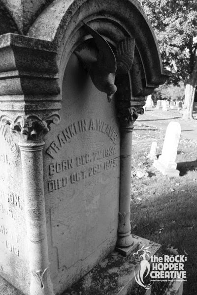
One of the coolest things about Riverview Cemetery is the old gravestones.
The embellishments and flourishes used are out of this world and certainly
not something you see with more modern headstones.
©2010 The Rockhopper Creative

This is the very reason I find this place a museum, of sorts.
The folks who made these headstones were truly artisans.
©2010 The Rockhopper Creative

John A. Roebling was a German immigrant who literally built an empire in Trenton.
His old factory building remain peppered throughout the entire South Ward.
©2010 The Rockhopper Creative

With the right eye, this place can be beautiful even in decay.
©2010 The Rockhopper Creative
As I mentioned earlier, I may be the only one who finds these images peaceful and beautiful but I guess sometimes we find solace in the oddest of places. If you'd like to view more of these images I invite you to please check out the gallery on my website which houses a few dozen images from this day. If you like 'em, please comment and let me know. If you hate 'em, that's ok too, but you can bugger off. ;-)
